SaaS explainer videos: the structure that converts
Most SaaS explainers describe a product. The ones that convert describe a situation the viewer recognises, then show the product resolving it. That order is the whole difference.
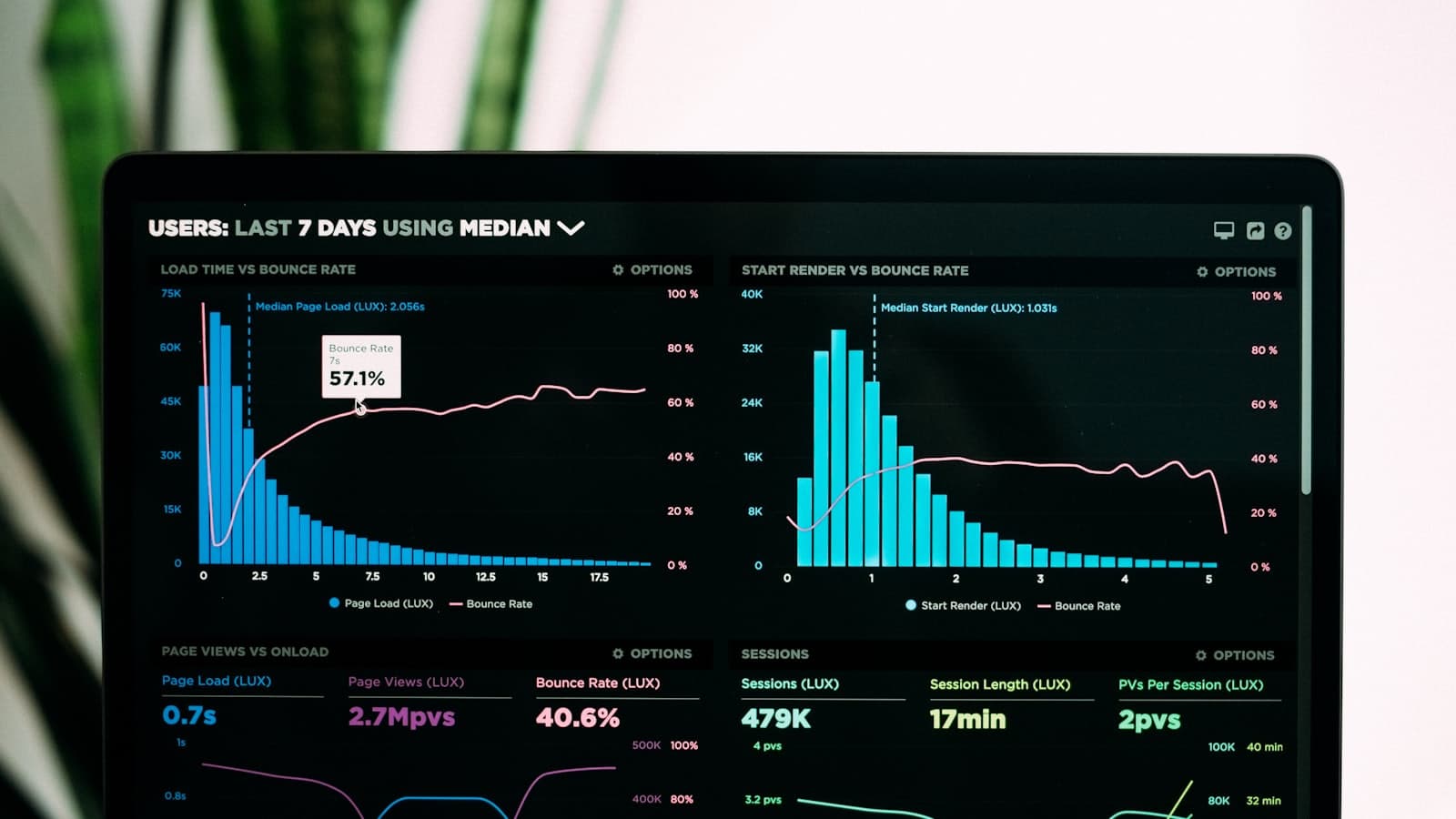
The standard SaaS explainer opens with a stylised character looking frustrated at a laptop, names a problem in the abstract, then tours four features. It is a format so established that it now signals category rather than product: a viewer can tell what kind of company made it and nothing about which one.
The explainers that book demos do something less comfortable. They describe one specific situation precisely enough that a viewer thinks about their own Tuesday, and only then show the software.
The beat sheet
- A situation, not a problem. Not teams struggle with collaboration. Something concrete: the spreadsheet that three people are editing at once and nobody trusts. Specific beats relatable, always.
- The cost of it, stated once. What that situation actually causes, time, errors, a decision made on stale data. One line. This is the beat that turns recognition into motivation.
- The product, doing the thing. Real interface, real data shape. The moment where the situation becomes tractable.
- The mechanism. How it works, at the level of a colleague explaining it in a corridor. Not architecture; the one idea that makes the rest make sense.
- The proof. A customer, a number, an integration they already use. Short and concrete.
- The next step. Book a demo, start a trial, see pricing. One action, named.
Real screen recordings or animated UI?
This is the decision that most affects both cost and credibility, and the right answer is usually a mix.
| Approach | Strength | Weakness |
|---|---|---|
| Raw screen recording | Unarguably real. Cheap. Fast to update when the UI ships a change. | Cursor wander, loading states, and real interfaces are rarely paced like film. |
| Animated UI rebuild | Every transition is designed. Can compress a 40-second flow into 6. | Expensive, and obsolete the moment the product redesigns. |
| Recording with motion enhancement | Real screens, with highlights, zooms and clean transitions on top. | Needs careful capture, and looks bad if the source recording is sloppy. |
The third is the working default for most B2B software. Capture the real product at high resolution, then use motion graphics to direct attention: a zoom to the field that matters, a highlight on the state change, a clean cut past the loading spinner.
Length, by placement
| Placement | Length | Note |
|---|---|---|
| Homepage hero | 30 – 60s | Autoplay muted. Must work without sound and without a beginning. |
| Paid social | 15 – 30s | One situation, one mechanism, one action. Nothing else fits. |
| Sales email or deck | 60 – 90s | The viewer opted in. Room for proof and a second use case. |
| Onboarding or docs | 2 – 5 min | Different job entirely: instruction, not persuasion. Do not merge the two. |
The last row is the one teams most often conflate. A product tour for existing users and an explainer for strangers have opposite goals, and one video attempting both does neither.
Writing the script
- Write it as speech, then cut a third. Read it aloud. Anything you would not say to a colleague comes out.
- Ban the category words. Seamless, robust, end-to-end, powerful, solution. They are noise, and every competitor uses them too.
- One idea per sentence. Voiceover cannot be re-read the way a page can.
- Name the user, not the market. An ops manager reconciling invoices is a person. Modern businesses is not.
- Write the last line first. If you know the action you want, the rest of the script has somewhere to go.

Captions and sound-off viewing
Assume the sound is off. On a homepage it is off by default, on social it is off most of the time, and in an open-plan office it is off out of politeness. That has three consequences worth designing for.
- Every claim in the voiceover needs a visual or typographic equivalent.
- Captions should be styled to the brand rather than left to the platform's default, which is the same for you and every competitor.
- The interface has to be legible at phone size, which usually means zooming further than feels natural on a desktop monitor.
What it costs
| Approach | Typical cost | When |
|---|---|---|
| Screen recording with light motion | $300 – $1,200 | The interface is strong and the flow is short. |
| Motion graphics with composited UI | $800 – $3,000 | The default for a homepage explainer that has to last a year. |
| Fully animated, custom illustration | $3,000 – $15,000 | The product is abstract, or the brand needs a distinct visual world. |
One thing worth budgeting for at the start: a version you can update. Software changes, and an explainer that cannot be edited becomes wrong within a year. Ask for source files, and keep the UI on separate layers. Video production pricing covers the rest of what should be in a quote.
If the explainer will also run as paid media, the first three seconds matters more than everything else on this page.
Common questions
- How long should a SaaS explainer video be?
- 30 to 60 seconds for a homepage hero, 15 to 30 for paid social, 60 to 90 when the viewer has opted in through a sales email or deck. Keep product tours and onboarding videos separate, those are instruction, not persuasion, and merging the two does neither job.
- Should an explainer use real screen recordings or animated UI?
- For most B2B software, real recordings enhanced with motion graphics: capture the actual product at high resolution, then use zooms, highlights and clean transitions to direct attention and cut past loading states. Fully animated UI is worth it when the product is abstract or the flow is too long to show honestly.
- How much does a SaaS explainer video cost?
- Roughly $300 to $1,200 for a screen recording with light motion work, $800 to $3,000 for motion graphics with composited interface footage, and $3,000 to $15,000 for a fully animated piece with custom illustration.
- What makes a SaaS explainer video convert?
- Opening with a specific situation the viewer recognises rather than an abstract problem, showing one mechanism properly instead of touring four features, and ending with a single named action. Specificity is what turns a video that is watched into a demo that is booked.